Paint colours have the power to truly transform your home – from bold and daring to muted and subtle, every color has the ability to tell a story while affecting your mood and emotions. It is important to carefully pick colours that are refreshing, soothing, and energizing. Hence, to make this process much simpler, my team and I have curated The 5 Hottest Interior Paint Colours & What to Avoid using professional guidance from the color experts at Benjamin Moore, Behr, and Sherwin-Williams.
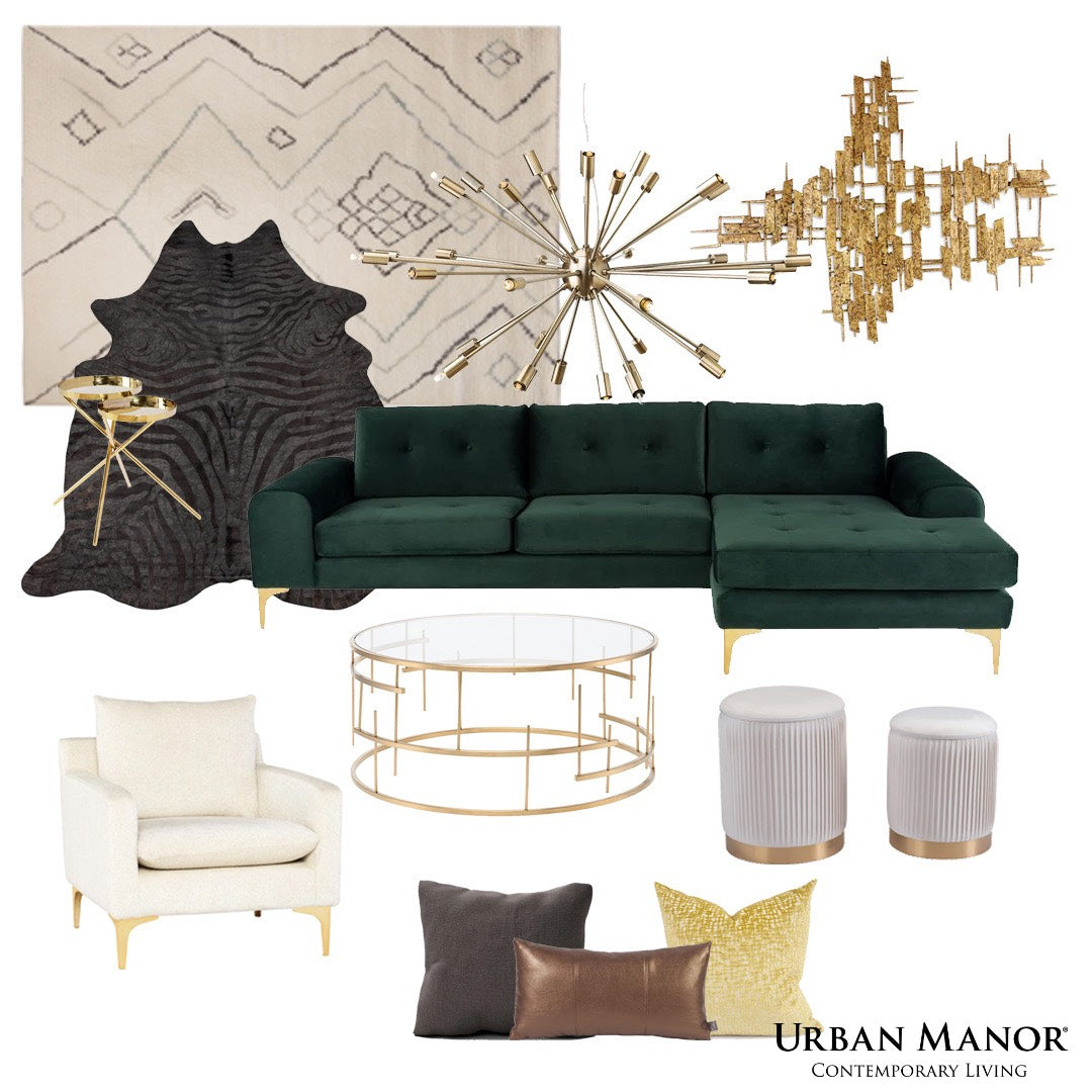
Mustard Yellow
Yellow has been making extensive headlines this year – especially after Pantone announced their colour of the year. This lively and friendly colour is the perfect accent color for modern homes. Highly recommended to be used as an accent colour for wall décor, pillows & throws, and vases & bowls. Not a recommendation for the bedrooms or the formal living rooms – but definitely a must for recreational areas, home theatres, and lounging points.
Steely Grey
It is true that greys will never go out of fashion! They are beautiful and timeless – but at the same time, you have to be very careful about the amount of paint you intend to use in your space. Observe your surroundings, if you are tight on space – it is recommended to avoid bold, dark greys and swap them for a lighter, airy tone.
Black Magic
Black paints define utmost sophistication, elegance, and luxury! And it is also true that they will always be trendy and stylish. However, their bold and authentic character could sometimes ‘weigh down’ the space and make it look darker and smaller than it is. Regardless of how timeless the colour is, it is not crucial for smaller-sized spaces such as, condominium or townhomes.
Blood Red
The colour of excitement, passion, and power. Red paint has the potential to raise the energy levels of your room to feel utmost overwhelmed and excited. The released inflammatory emotions are bound to make you feel uncomfortable if you spend a lot of time in that room. Hence, even if you are a fan of the colour – try incorporating it as an accent colour instead! We suggest a throw pillow or an area rug.
Dusty Pinks
Natural and artificial light has a major role to play with this paint colour. One of the major challenges with pinks is that they look more saturated on walls than on the paint decks. Even though it is a pretty paint colour – it is ideal to minimize their use or use sparsely throughout your home as ottomans, table top décor or as an accent chair.
Now that we have discussed The 5 Hottest Interior Paint Colours & What to Avoid, how are you going to use these expert-curated suggestions to improve your home’s colour palette? I would love to know your thoughts on this article, comment below!
Leave a comment
This site is protected by hCaptcha and the hCaptcha Privacy Policy and Terms of Service apply.